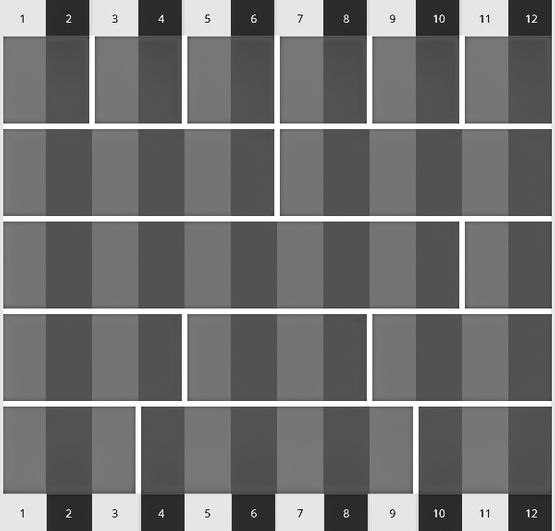
Websites built on our platform follow a layout system that includes rows, columns, and modules that can be combined in an infinite amount of ways to accommodate your desired website design.
Rows are horizontal containers spanning the width of the site's content area or the entire screen area. Rows can be styled individually so that each row looks unique in terms of design.
Columns are vertical containers nested inside the rows. The width of each individual column can be easily adjusted.
Modules are containers for the various types of content on your site (text, buttons, maps, forms and more). Our platform has all the modules you need to create a professional website for your business.
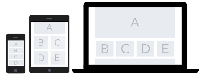
All websites built on our platform are fully responsive. This means that no matter if your website visitors are coming from a smartphone, tablet or desktop - your website will look fantastic and be easy-to-use.
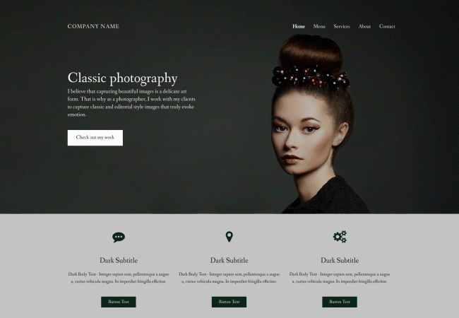
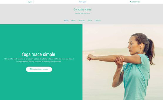
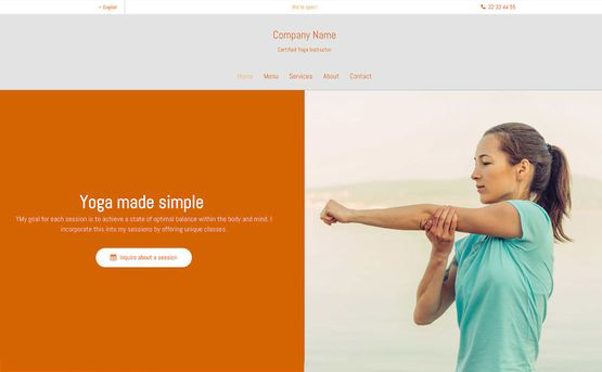
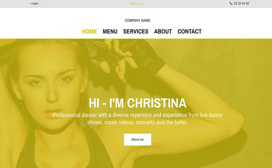
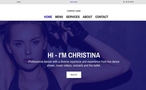
You can easily change the design of your websites in just a few clicks. Our platform ensures that your fonts and colors are always consistent throughout the website for a professional look and feel. Update your website theme at any time without effecting your content.
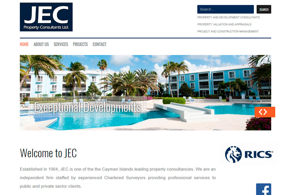
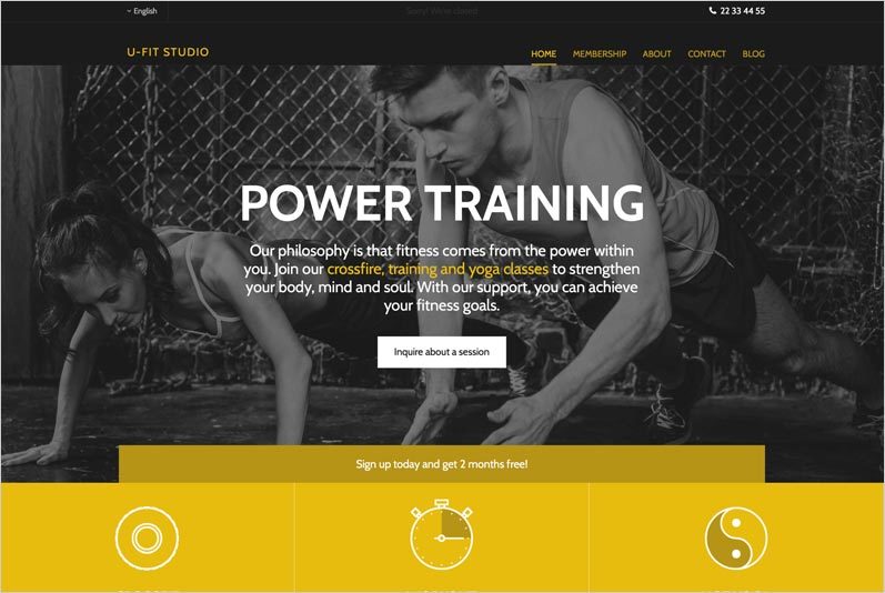
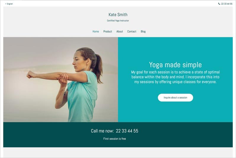
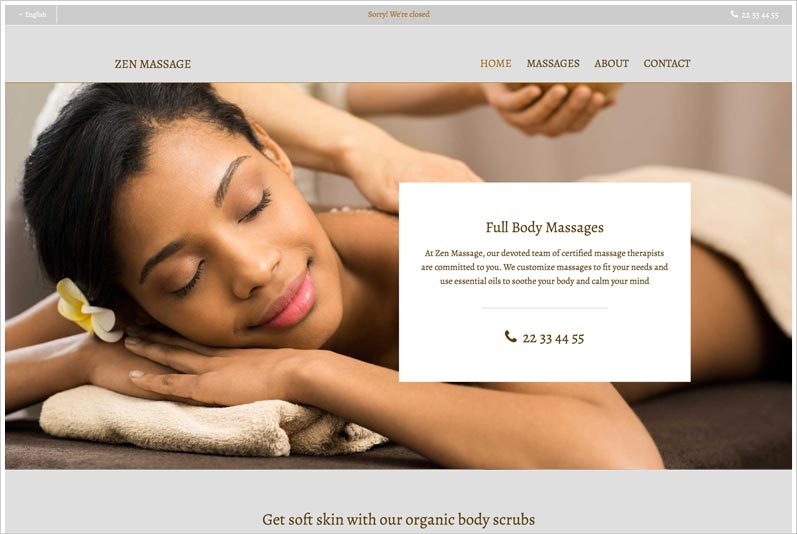
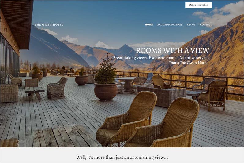
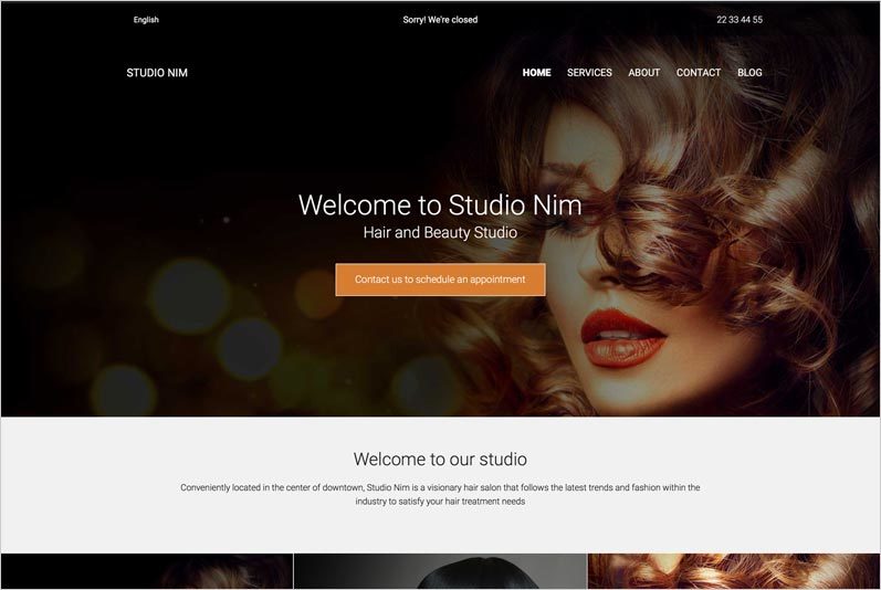
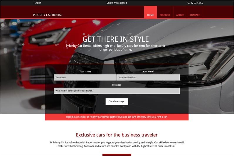
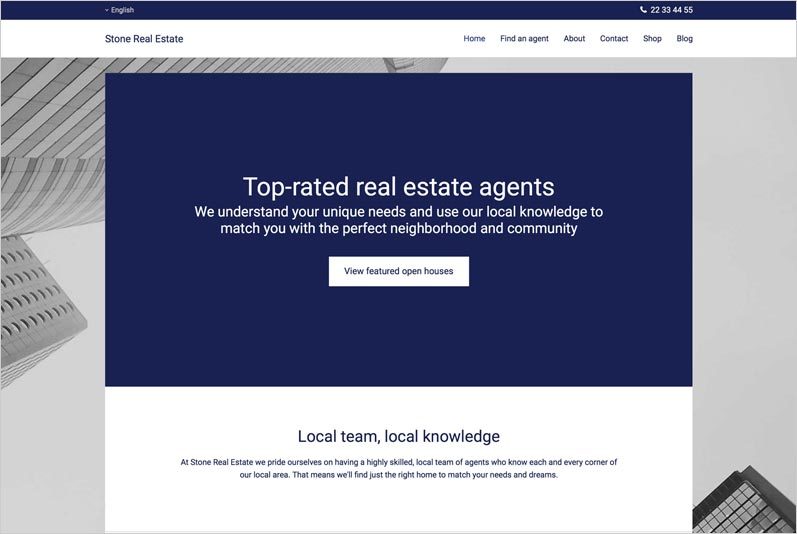
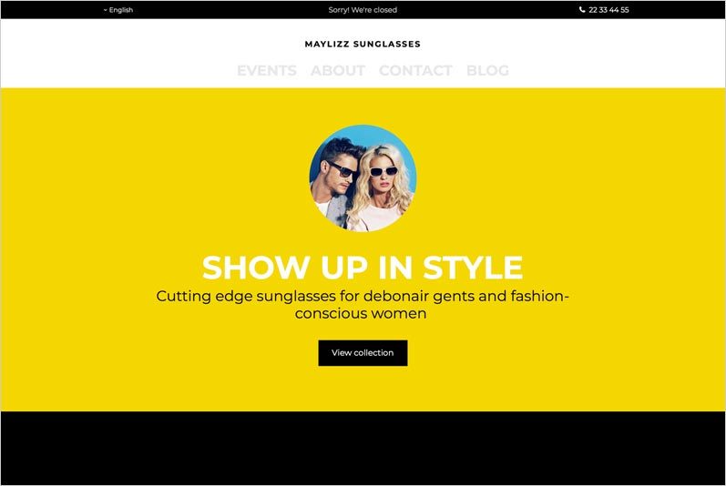
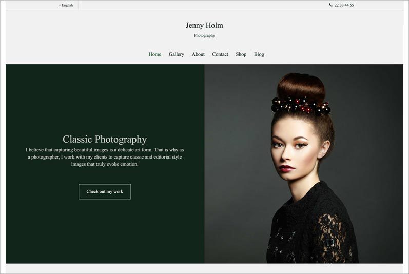
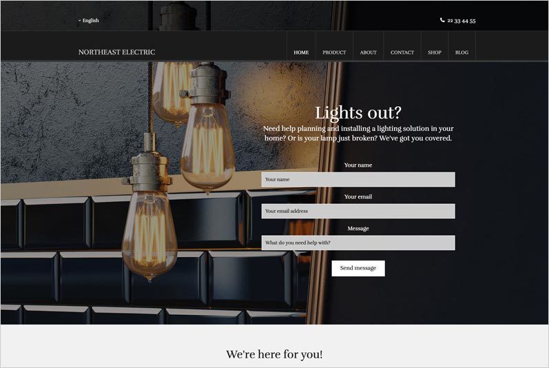
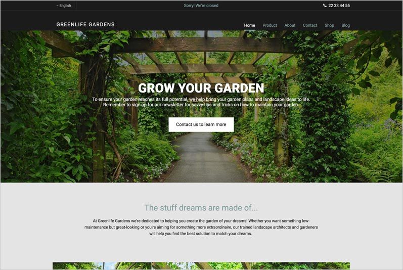
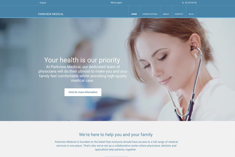
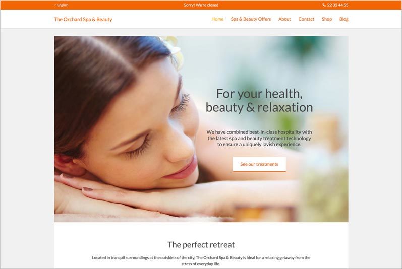
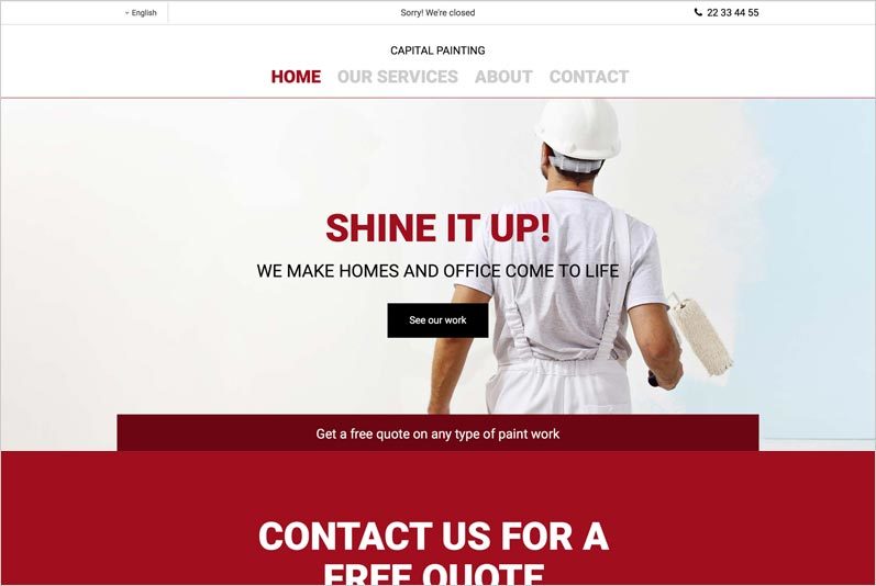
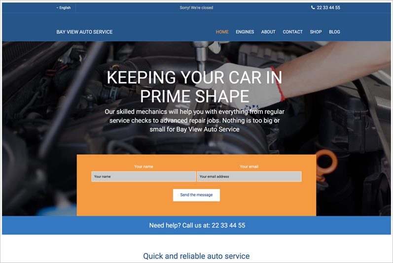
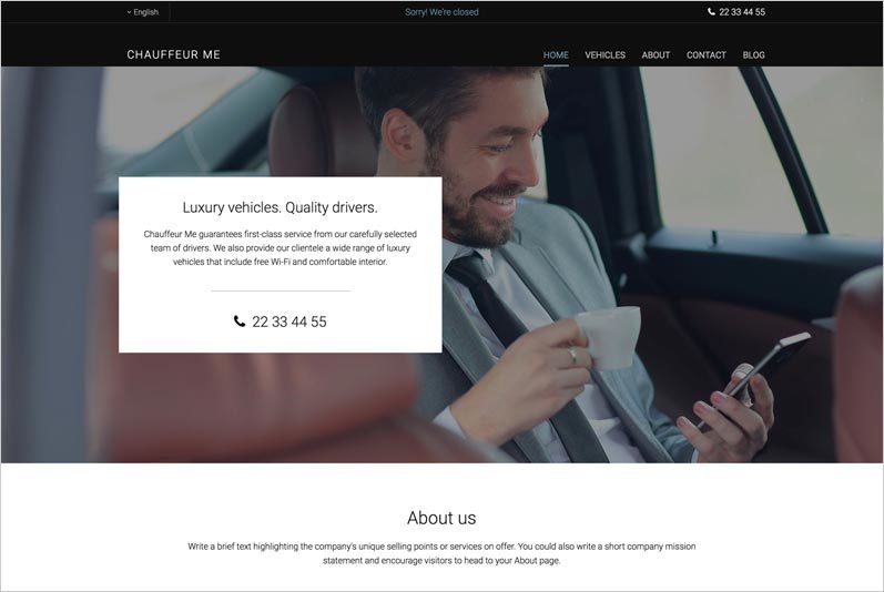
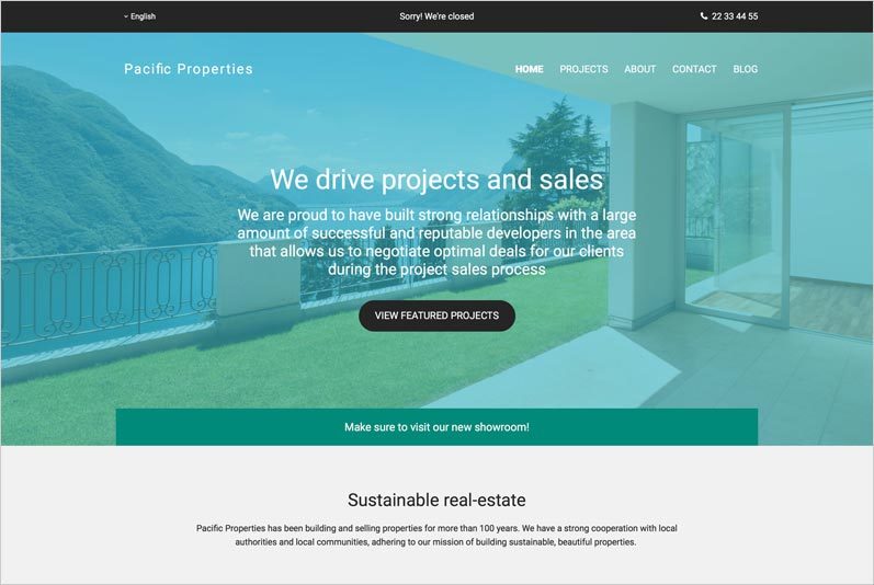
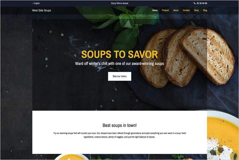
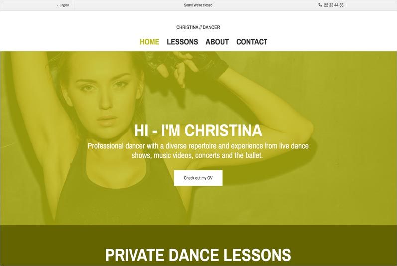
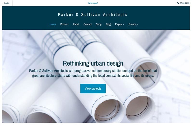
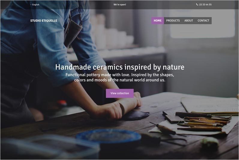
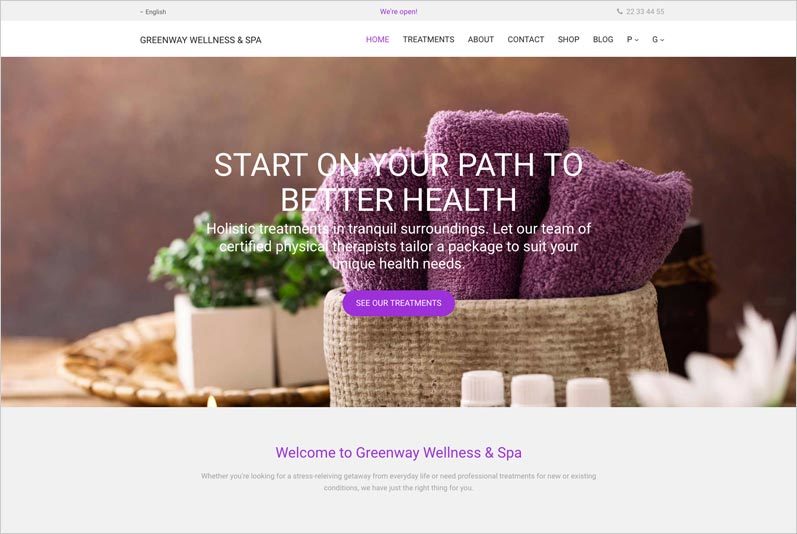
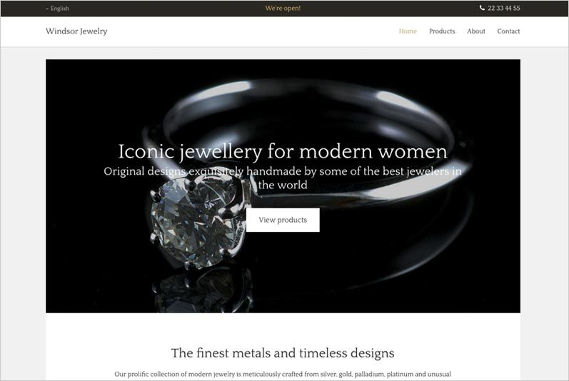
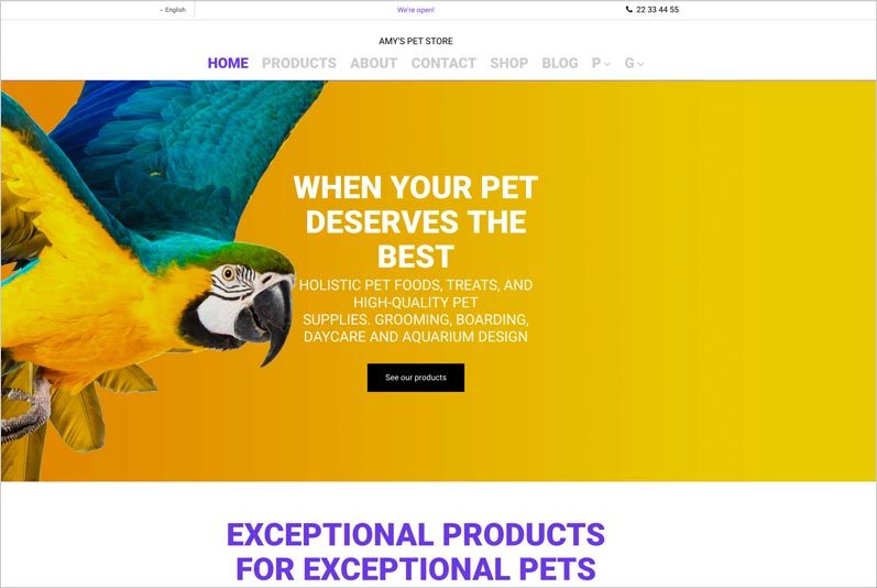
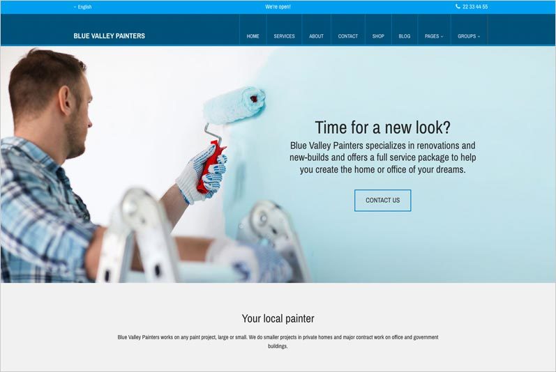
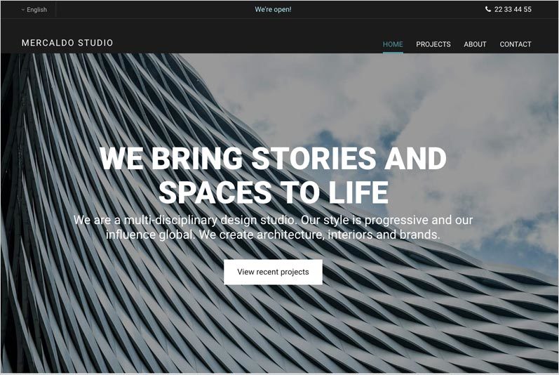
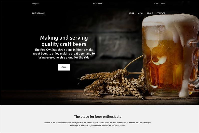
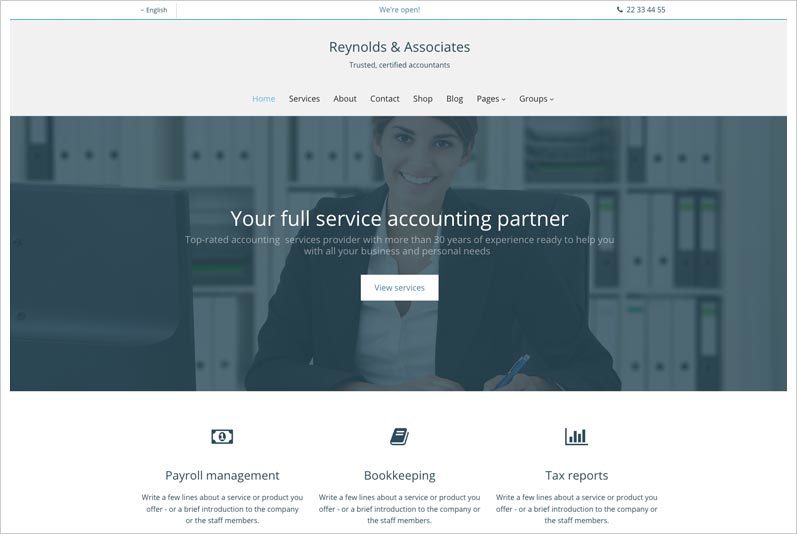
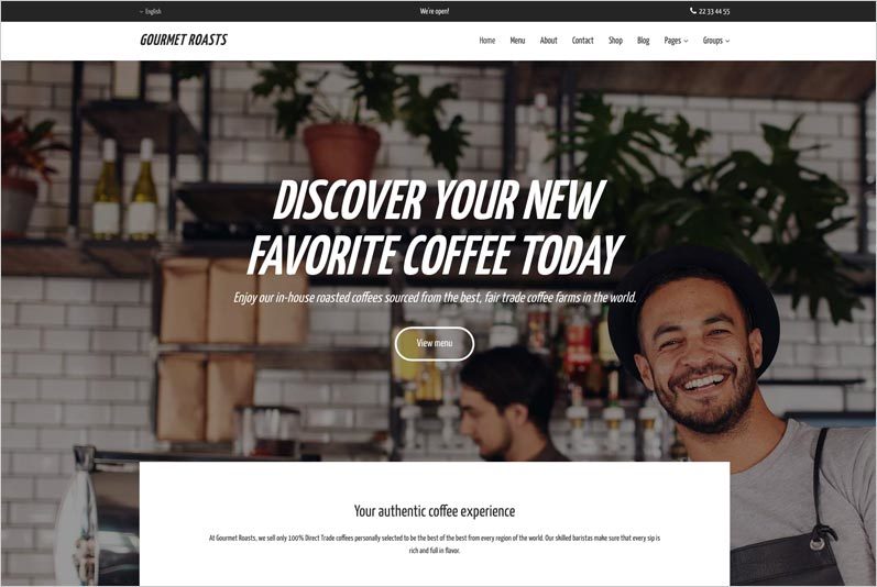
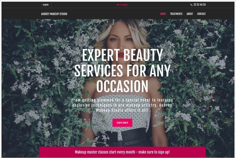
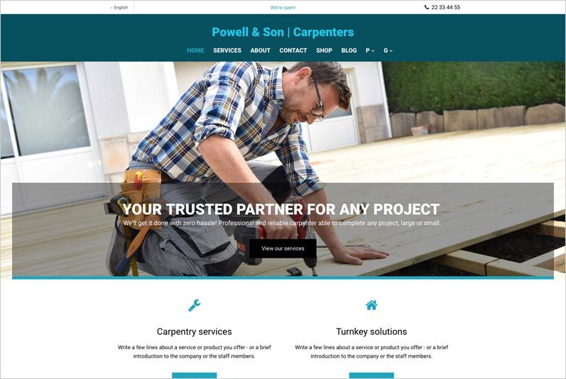
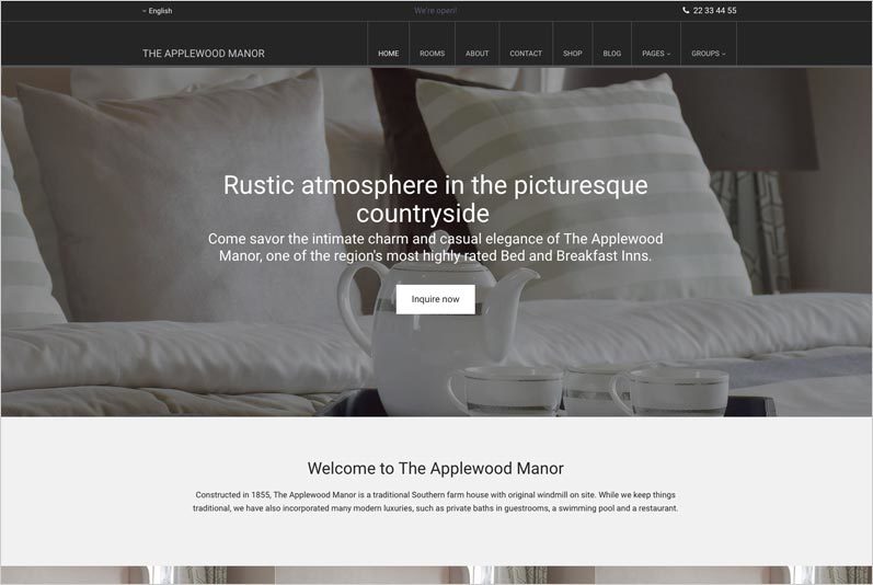
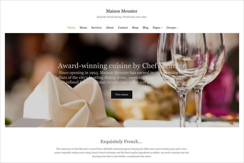
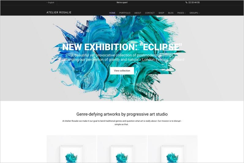
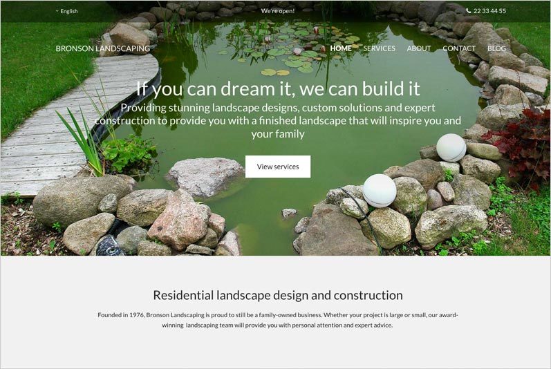
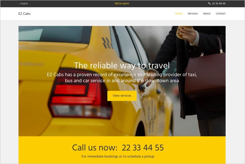
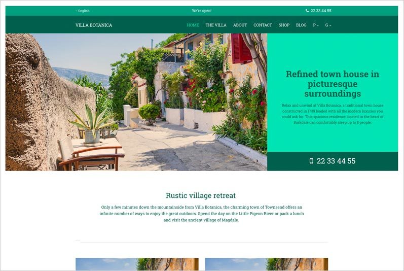
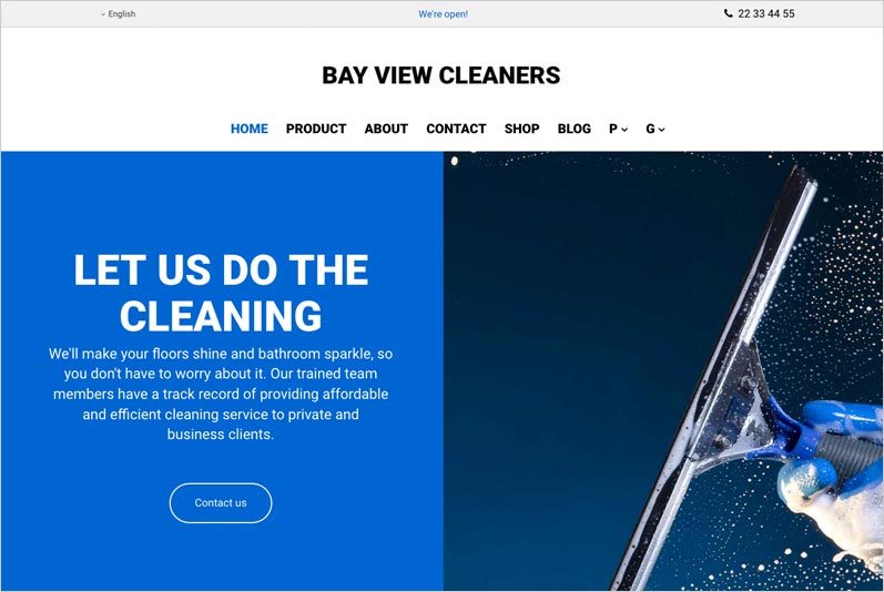
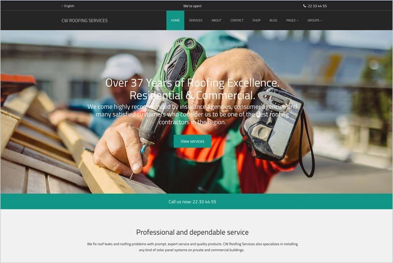
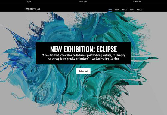
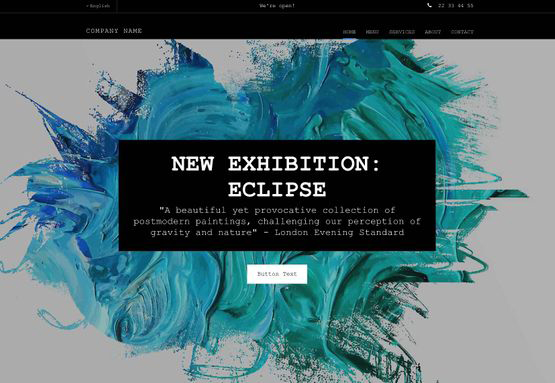
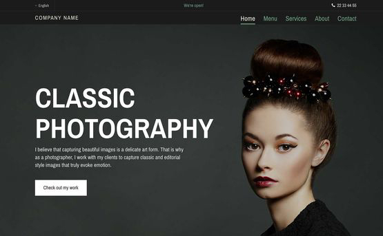
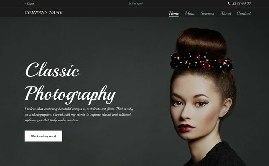
We've got a wide selection of predefined themes that you can choose from when building your website. Our themes are beautifully designed and pre-optimized for viewing on all devices.
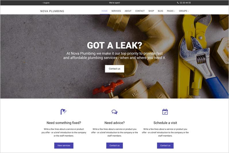
Color contributes to the overall attractiveness of your website and represents your brand identity. Our platform ensures that colors are consistently used throughout your website for a professional look-and-feel, and our website designers can easily change the colors for you, if needed.
Fonts also help depict your brand identity on your website. Our platform makes it easy to consistently use different fonts across your website.